This story was originally posted on the School of Data’s website.
When I signed up to the School of Data mailing list, I didn’t quite know what I was getting myself into.
Within two days of joining, I was invited to lead a data expedition at the Kopenlab citizen science festival alongside the EuroScience Open Forum in Copenhagen, Denmark.
My first reaction was trepidation (I didn’t know what a data expedition was and I haven’t worked extensively with datasets for a few years) but Michael Bauer at the School of Data assured me that it would be a fun learning experience. So I enthusiastically agreed and my first quest with data began.
I quickly learned that a data expedition aims to discover stories hidden in the ‘Land of Data’. As the expedition guide, I would set the topic and encourage my expedition team to work together to solve real-life problems, answer questions and tell stories with data.
An important side note (and one I reiterated several times during the expedition) is that there are no right answers and no expected final output. The point of a data expedition is to think freely and creatively, learn from each other and hopefully develop some new skills and a lifelong love of data.
Given Copenhagen’s reputation as the most bike friendly city in the world, we choose to focus on the comprehensive cycling statistics that Denmark collects every day.
For example, did you know that more people in greater Copenhagen commute by bicycle than everyone who rides bikes to work in the entire United States? This information can be found in easily accessible datasets such as the EU public dataset and Denmark’s national statistics database.
We came up with a few guiding to stimulate the imaginations of our expedition team:
How far do I have to walk to get a bikerack in Copenhagen?
Are there areas where bikeracks are more dense and how does this correlate with where people are riding bikes?
How many bike accidents are caused in Copenhagen because cyclists are drunk?
Do more young or old people ride bikes in Copenhagen?
At which age do people spend most money on bicycles?
So armed with some sample datasets, a laptop and flipchart, I set off to Copenhagen to meet Ioana, Deepak, Akash, Mirela and Tobias – my expedition team.
After finding 10 things in common with each other, our first task was to work out everyone’s strengths and weaknesses so we could set loose roles. Ioana became our analyst & engineer (data cruncher), Deepak and Akash were our storytellers (found interesting angles to explore and shaped the final story), Mirela was our scout (data hunter) and Tobias was our designer (beautify the outputs to make sure the story really comes through).
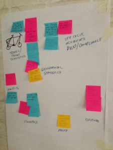
Our next task was to come up with our expedition questions and we took to this task very enthusiastically, coming up with more questions than we had time to explore! To make the questions easier to tackle, we decided to group them by theme (travel usage, life cycle/accidents/rules/compliance, geographical stats, economics, policy, culture). The group split in half to tackle two different sets of questions.
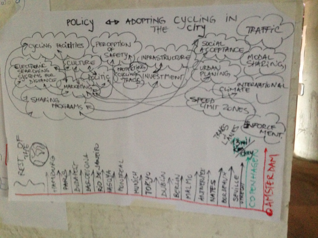
 Deepak, Akash and Tobias looked at what policies influenced cycling adoption in Denmark and compared these to a number of different cities across the world.
Mirela and Ioana mapped the number of cyclists in different areas of Copenhagen in order to develop a density map, which could be overlayed with other data such as where cyclists are most active at certain times of day, accident rates/locales and bikerack density.
We spent the next two hours of the expedition searching and scraping various datasets (a full list can be found in this googledoc) in order to come up with our stories to tell the Kopenlab citizen science festival attendees.
We came across a few hurdles, namely the “cleanness” and consistency of the data. Often the datasets were only available as PDFs (CSV and excel spreadsheets are much easier to work with) and data headers often didn’t have references.
“It would be nice to have it all in a bigger table,” Ioana said.
In the face of these challenges we gave each other a helping hand to find alternative exploration routes (much like a real quest, really).
Another one of the great aspects of a data expedition the focus on skill sharing. Ioana had a great understanding of Google fusion tables so she was able to show some of the other participants how to sort and analyse data using this tool. Unfortunately we didn’t get much time to explore the plethora of open source data analysis and visualization tools (some are listed on page 5 of this doc).
So after three hours traversing the wilds of Copenhagen’s bike data we had two stories to tell.
Ioana presented her team’s heat map showing that the number of cyclists was most dense in the northwest part of Copenhagen.
Deepak presented his team’s infographic showing that many factors influence cycling usage in urban centers:

We had a great time exploring these datasets, but with the short time we had available, we only really scraped the surface of Copenhagen’s bike data stories. Luckily Matias and his bikestorming crew ran another expedition in Copenhagen two months later and were able to build on what we learnt…
Stay tuned for part two of our biking blog series written by Matias Kalwill, founder and designer of Bikestorming.